
Why rotation graphs matter: a report on the RPRG
Most questions that matter to an allocator are relative, not absolute. Not will banks go up? but will banks beat the index? Not is IT a good sector? but is IT a better home for the next rupee than pharma? Price charts answer the absolute question one instrument at a time. The Relative Performance Rotation Graph (RPRG) was built to answer the relative one for a whole universe at once.
This is a report on the technique: where it came from, what it measures, how it is used, and — using our own data on the NSE sectoral indices since 2012 — how much of the folklore around it survives contact with the numbers. It assumes you know what an index is and what a moving average does. It is not a manual for the tool; that is a separate guide.
Origins
The graph was devised in 2004–2005 by Julius de Kempenaer, then a sell-side analyst in Amsterdam. His institutional clients cared far more about relative performance than directional calls, and were drowning in information: dozens of sectors, hundreds of stocks, each with its own relative-strength chart. They needed one picture that separated leaders from laggards and showed which way each was heading.
His answer was to normalise every relative-strength line so that all were measured in the same units around the same level, and plot each as one point on two axes: the trend of relative strength, and the momentum of that trend. The technique became a standard institutional tool under the name Relative Rotation Graph. Ours is an independent implementation of the idea on Indian market data; we call it the Relative Performance Rotation Graph to say what it does rather than borrow a trademark.
What the two axes measure
Everything starts from a relative-strength line: the price of the thing divided by the price of the benchmark. If NIFTY IT ÷ NIFTY 50 rises, IT is beating the index — whether or not either is going up. The graph turns that line into two numbers.
RS-Ratio is the trend of relative strength. The RS line is divided by its own weighted moving average, then smoothed again by the same length, and scaled so that 100 means "tracking the benchmark". Above 100, relative strength has been trending up over the calculation window; below 100, down.
RS-Momentum is the rate of change of RS-Ratio, built the same way — RS-Ratio divided by its own weighted average, scaled to 100. Above 100, the relative trend is accelerating; below, it is fading.
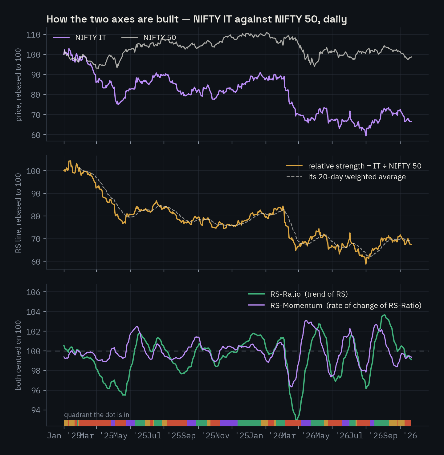
NIFTY IT against NIFTY 50, daily, 20-bar default. Top: prices. Middle: the relative-strength line. Bottom: the two indicators; the strip along the base is the quadrant at each date.
The figure makes a point that catches most first-time readers. From January 2025 to September 2026 NIFTY IT fell 33.5% while NIFTY 50 was flat, so the relative-strength line (middle panel) collapsed by a third. Yet RS-Ratio (bottom panel) spent as much time above 100 as below it: on 124 of 427 trading days IT sat in Outperforming. That is not a bug. RS-Ratio measures the trend of the recent window, not the level, and a sector that has fallen a long way still has month-long bounces in which it beats the index. The graph says whether relative strength is improving or deteriorating now; the RS line says where it has come from.
The reason for normalising is comparability. Raw relative-strength lines have arbitrary levels — IT ÷ NIFTY 50 might be 1.6, PSU banks ÷ NIFTY 50 might be 0.3 — so they cannot share a chart. Expressed as "percent above or below its own recent average", fourteen sectors or five hundred stocks can sit on the same axes and be read against each other.
The four quadrants and the cycle
Two axes crossing at 100 make four regions. We name them for what they mean against the benchmark.
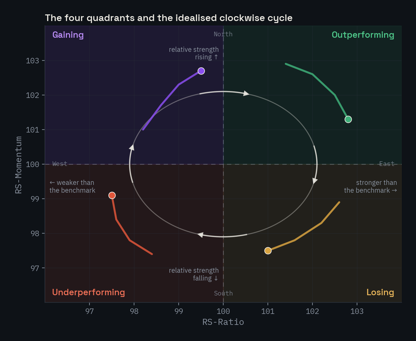
The grey loop is the idealised cycle; the coloured tails show a symbol at each stage of it.
| Quadrant | RS-Ratio | RS-Momentum | Meaning |
|---|---|---|---|
| Outperforming (top-right) | above 100 | above 100 | Ahead of the benchmark and pulling further ahead. The established leaders. |
| Losing (bottom-right) | above 100 | below 100 | Still ahead, but the lead is shrinking. Leadership fading. |
| Underperforming (bottom-left) | below 100 | below 100 | Behind and falling further behind. The established laggards. |
| Gaining (top-left) | below 100 | above 100 | Still behind, but closing the gap. Where recoveries start. |
In the original literature these are Leading, Weakening, Lagging and Improving.
The claim that gives the graph its name is that symbols tend to travel clockwise through these regions: Gaining → Outperforming → Losing → Underperforming → Gaining. The reason is mechanical rather than mystical. RS-Momentum is the rate of change of RS-Ratio, and a rate of change turns before the thing it measures — momentum peaks while the ratio is still rising, and troughs while the ratio is still falling. So a symbol's momentum crosses 100 first (moving it north or south), and its ratio follows (moving it east or west). Drawn on the plane, that ordering is a clockwise loop.
One rotation, in the wild
Idealised loops are tidy; real ones are recognisable. Here is NIFTY METAL against NIFTY 50 over eleven weeks in 2025.
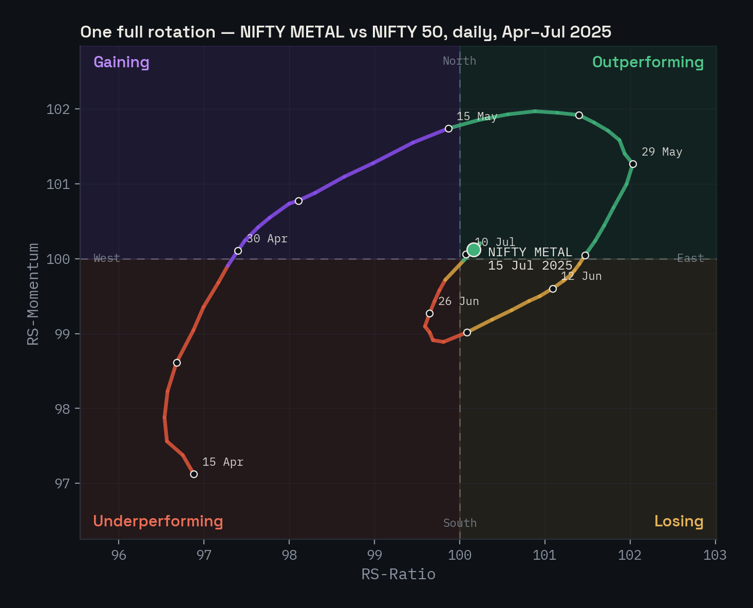
NIFTY METAL vs NIFTY 50, daily, 15 April – 15 July 2025. One circuit in three months; dots mark weeks.
On 15 April the sector was deep in Underperforming. Momentum turned first: by 30 April the path had crossed north into Gaining with the ratio still below 100. The ratio followed, crossing east into Outperforming around 15 May. Momentum then rolled over — the arc flattens and drops — and by 12 June the sector was in Losing, still ahead of the index but no longer gaining on it. It dipped into Underperforming at the end of June and turned up again.
In returns: between the crossing into Gaining (30 April) and the crossing into Losing (12 June), NIFTY METAL rose 8.9% against 2.3% for NIFTY 50 — a 6.5% relative gain in six weeks, all of it inside the north-east half of the graph. The turn was visible on 30 April, two weeks before the ratio confirmed it; the arc flattened in late May, before the Losing crossing.
What it is used for
The graph's job is to organise attention. Its uses follow from that.
Top-down allocation. The same picture works at every level if the benchmark matches: sectors against NIFTY 50, stocks within a sector against that sector's index. An allocator can walk down the hierarchy with one question — what is gaining ground here? — instead of switching tools at each level.
Sector tilting. The most common professional use. Overweight the east with a northward heading, underweight the west heading south, and watch the two transition quadrants, because that is where leadership changes. The graph does not say how much to tilt; it says where to look.
Stock selection within a sector. Set the benchmark to NIFTY BANK and plot the bank stocks. The graph now separates the banks leading the sector from those being carried by it — a distinction a sector ETF hides completely.
Avoiding the wrong places. The south-west corner, heading further south-west, is the graph's clearest message, and avoiding it is often worth more than chasing the north-east.
Relative-value pairs. Long the east, short the west; the benchmark cancels out.
Reading the regime. Where the cluster sits describes the market, not just its parts. Defensives crowding the north-east while cyclicals crowd the south-west is a risk-off rotation, whatever the headline index is doing.
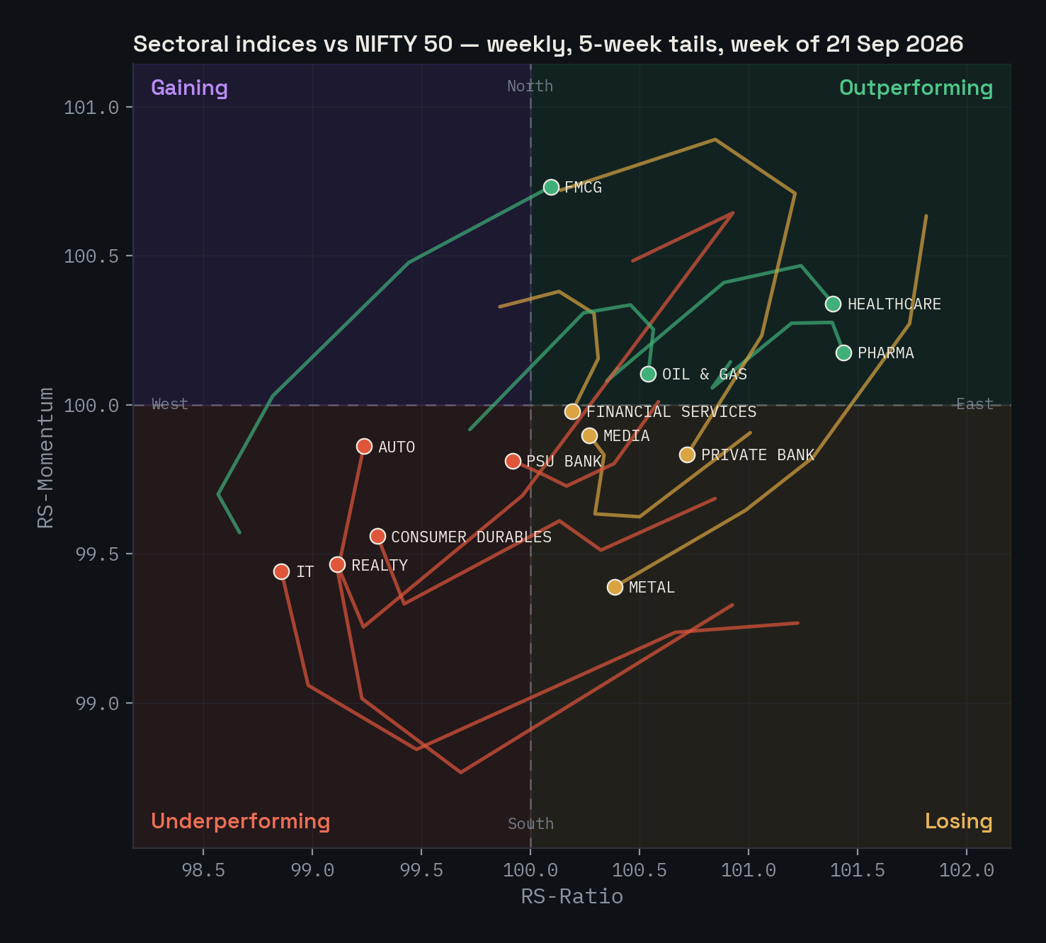
The sectors, weekly, as of 21 September 2026. Healthcare, pharma and oil & gas lead; FMCG has just rotated in from Gaining; the financials sit in Losing; IT and realty lag, with auto and consumer durables showing tails that have begun to turn north.
Layering timeframes. Weekly and daily graphs of the same universe often disagree, and the disagreement is information: a sector in Underperforming on the weekly but circling through Outperforming on the daily is bouncing inside a longer downtrend. Practitioners read the weekly for the regime and the daily for timing.
What the data says
Folklore is cheap. We ran the tool's own maths over the thirteen NSE sectoral indices back to 2012 — 8,458 weekly readings and 40,000 daily ones — and asked two questions: does rotation actually happen clockwise, and does a sector's quadrant say anything about what it does next?
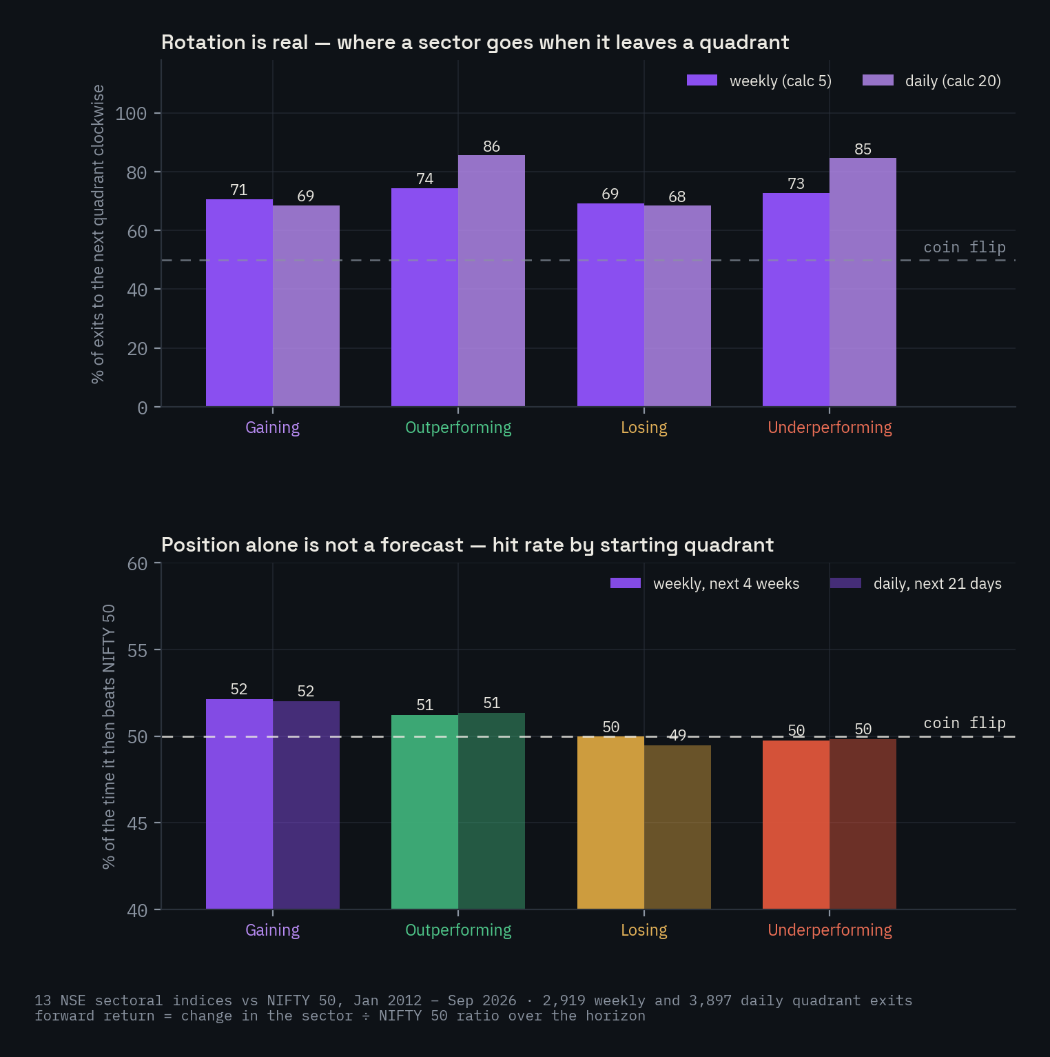
Thirteen sectoral indices vs NIFTY 50, 2012–2026.
Rotation is real. Of 2,919 weekly quadrant changes, 72% went to the next quadrant clockwise. On daily data the figure is 77%. The breakdown is instructive:
| Leaving… | Next quadrant clockwise | Back a quadrant | Across the centre |
|---|---|---|---|
| Gaining | 71% | 29% | ~0% |
| Outperforming | 74% | 5% | 21% |
| Losing | 69% | 31% | ~0% |
| Underperforming | 73% | 4% | 23% |
Weekly, calc 5.
The transition quadrants are where the false starts live: three in ten entries into Gaining fall back into Underperforming without reaching Outperforming, and the same share of Losing entries recover. And exits from the two "established" quadrants almost never go backwards — but one in five jumps straight across the centre, a sector going from leading to lagging in a week. Those jumps are why the tail matters more than the dot.
Position alone is not a forecast. Take every weekly reading, note the quadrant, and ask whether the sector beat NIFTY 50 over the next four weeks: 52% for Gaining, 51% for Outperforming, 50% for Losing, 50% for Underperforming. Over 13 weeks the ordering scrambles; daily data tells the same story. A rule that bought whatever was in Outperforming would have been flipping a slightly weighted coin, and costs would have eaten the weight.
Direction adds a little. A sector in Gaining with both ratio and momentum rising beat the index 52–53% of the time over the next month; one in Outperforming whose tail had turned south-west did so 48% of the time. Ranking helps too: the three highest RS-Ratio sectors out-returned the three lowest over the following quarter in 54% of weeks. Real edges, and small.
The honest summary: the graph is a good map and a poor signal. It reliably describes what has been happening — the rotation is not an illusion — and that is worth a great deal to anyone deciding where to spend attention or how to lean a portfolio. On its own it does not say what happens next, and nobody who uses it professionally pretends otherwise.
Limitations worth stating plainly
- Relative, not absolute. Outperforming in a falling market means falling less. A north-east-only portfolio can lose money in a bear market; it just loses less than the index.
- It lags. Two rounds of smoothing mean turns are confirmed after they begin. The tail's curvature is the earliest hint, and it is a hint.
- It is parameter-sensitive. The calculation length sets the speed of the loop: on the weekly default a sector stays in a quadrant for a median of three weeks and a circuit takes three to four months; on the daily default the median stay is nine trading days. Readings are only comparable at the same settings.
- The benchmark is a choice. Against NIFTY BANK a private bank can be a laggard while against NIFTY 50 it is a leader. Both are true; they answer different questions.
- Not a system. There are no entry or exit rules in it. It is an input to judgement; the study above is why.
Using it well
Three habits separate the people who get value from the graph from those who get noise.
- Read direction before position. The dot says where a symbol is; the tail says where it is going. A symbol entering Losing on a straight south-west tail and one leaving it on a curling north-east tail share a quadrant and mean opposite things.
- Let the weekly decide what the daily may tell you. Daily rotations the weekly does not confirm are, more often than not, hiccups.
- Treat it as a filter, not a trigger. Let it narrow the universe to the names whose relative trend is turning, then do the work on those. That is what it was built for in 2004, and still what it is best at.
The tool itself is at tools.trading-sparks.com/rprg, and the guide to reading it is here.
Method. Indicators follow our tool's construction (weighted moving averages, 20 bars daily / 5 weekly, scaled to 100). The study covers the thirteen NSE sectoral indices with history before 2022, January 2012 – September 2026, against NIFTY 50; forward return is the change in the sector-to-index ratio. Relative Rotation Graph, RRG and JdK RS-Ratio / RS-Momentum are trademarks of RRG Research; the history draws on their material and StockCharts' ChartSchool. Markets carry substantial risk of loss; past and backtested performance is no guarantee of future results. Trading-Sparks provides research, education and tools only — not financial advice.
Want a strategy like the ones discussed here built and validated? See the service →